Crafting a colourful new website for The Art Room, in Kibworth
The Art Room, an arts and crafts start-up, needed a colourful and vibrant website to reflect their branding. Aimed at both children and adults, the collaboration between charlie. and The Art Room made something positively unique.
The brief
Being a new business, The Art Room needed a flashy new website, so it was designed to accommodate their colourful personality, warmth and quality of service. With the small business going through branding procedures mid-way through building the site, the colour scheme was changed to match the newly made pink/purple logo.
The design
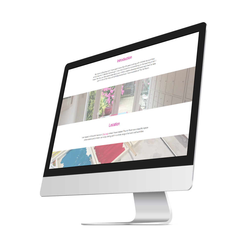
There was a clear indication of where the design was going to be steered when I first met up with the owner, Beverley. Once the target audience was clarified, it was very important that the site was made to be accessible, clear and simplistic. The use of parallax scrolling images, whitespace and big call-to-actions made this design stand out among other businesses.
The site was structured with a modern idea in mind, using the big menu as a staple user eye piece throughout the entire experience. Splitting the site into two different sections, children and adults, it made the user journey much more personalised. This design choice was perfect, as it made the mobile experience much more seamless.
The results
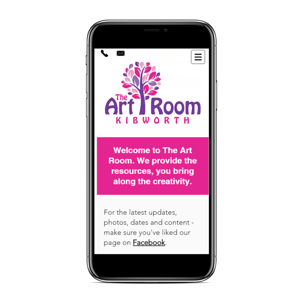
A fully optimised website for all devices, with a clear design and a variety of features to make the user feel at home. The use of the 'mail' and 'phone' button always being available in the top right corner become memorable upon browsing for the first time. Additionally, there is a consistent call-to-action at the bottom of each page - all leading to the same contact form. Not only a perfect choice for the customer journey, but also excellent for the site conversion rate!
“An excellent personal service where nothing was too much trouble - resulting in a website that not only am I delighted with, but one that is having a positive affect on the growth of my business. Thank you.”


